Artist’s Website
A Responsive Website
Client: Local artist
Role: UX Research, UX/UI Design
Year: 2024
Background
For this project I worked with my mum, a locally exhibiting artist, who wanted to broaden her online presence and capacity to showcase her paintings to potential exhibiters and buyers.
She has recently started using social media to promote her work and had been exploring new ways to promote her work.
Goals
The objective of this project was to design a responsive website for a local artist, ensuring the site effectively addressed her business needs while authentically representing her artistic style and personality.
Problem
While social media can increase visibility for an artist's work, it often lacks the level of curation and personalization that many artists desire. For artists applying to exhibitions, it is essential to have a digital space that not only showcases their work but also authentically represents their artistic style, personality, and creative process. Without such a space, artists may struggle to present their work in a professional and impactful way to curators and potential collaborators.
Impact
For this project I worked as a solo designer and created a responsive website that addressed the artist’s business and creative needs and leveraged user feedback to fine tune the visual and functional development the site.
Research
Following an initial meeting with the client to clarify the brief and their requirements, the aim for my research was understand what local art buyers and gallery owners expect to see on an artist’s website so as to customise the responsive website accordingly. I looked at:
Goals
What the client expects to see on their website
What purchase journey will a customer make
How do buyers use an artist's website
What preferences do buyers have with art purchases
Methodologies
Competitive research - see how other local artists are showcasing their work digitally
Participatory Design- include the client and end users in the design process to incorporate their experience, feedback and suggestions
Usability testing - combine usability testing and participatory design to test wire frames with the client and end users
Competitive Research
I compared the notable features between with three key locally exhibiting artist’s websites, and summarised:
Simplicity and use of white space is an advantage to showcasing the artwork/product
Visual design is a key component to support business goals
Clear CTA/visual hierarchy are required to enable actions to be completed by buyer with ease
Large interactive gallery spaces suit ‘showcase’ style of website
Varied layout keeps user interested
Use of vertical space (vertical and horizontal scrolling) should be utilised
I initially met with the client to gain further understanding about their business needs and requirements, then met with 3 art buyers who have experience of buying art from from local and well known artists. With both client and user I did user interviews and participatory design, where we looked at a several website templates and talked their preferences around visual design as well as functionality. A summary of my findings is below:
User Research & Participatory Design
Research Synopsis
Overall, the users had positive experiences when interacting with artists about purchasing work, with no significant pain points. Users expressed that they would want to see artwork in person before purchasing, which aligns with the client’s intentions, as they do not wish to sell directly through the site at this stage. Their preferences for visual design and layout leaned towards clean, minimal sites with simple navigation.
After synthesising the client and user interview findings through infinity mapping, I worked at further defining business, client and technical goals. I was then able to create a user personas that would help keep the user’s needs in mind as I progressed into the Ideation phase.
Define
User Persona
Ideation
Feature Prioritisation
Considering Maz’s goals, I started outlining what features the responsive website would need to help her achieve them and further prioritised the feature list via the matrix below:
Site Map
Having identified the priority features I outlined key pages required in the below site map.
User Flow
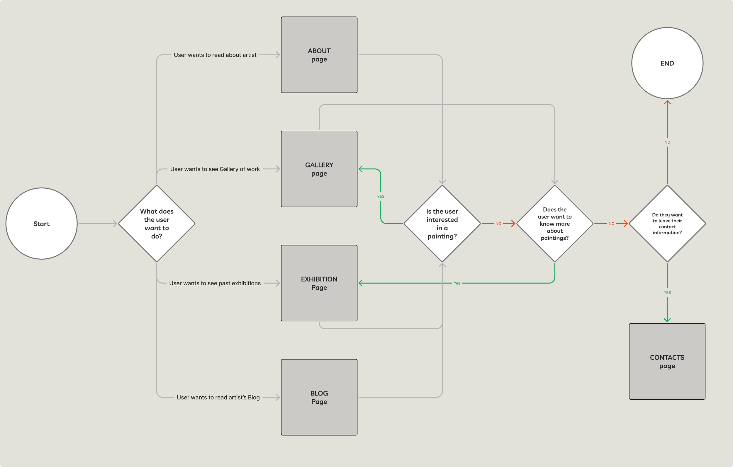
With the key features and pages outlined, I devised a user flow to consider the pathways and decisions points that Max would need to work through to achieve her goal:
“I want to view a specific painting or collection, and get in touch with the artist to discuss the work.”
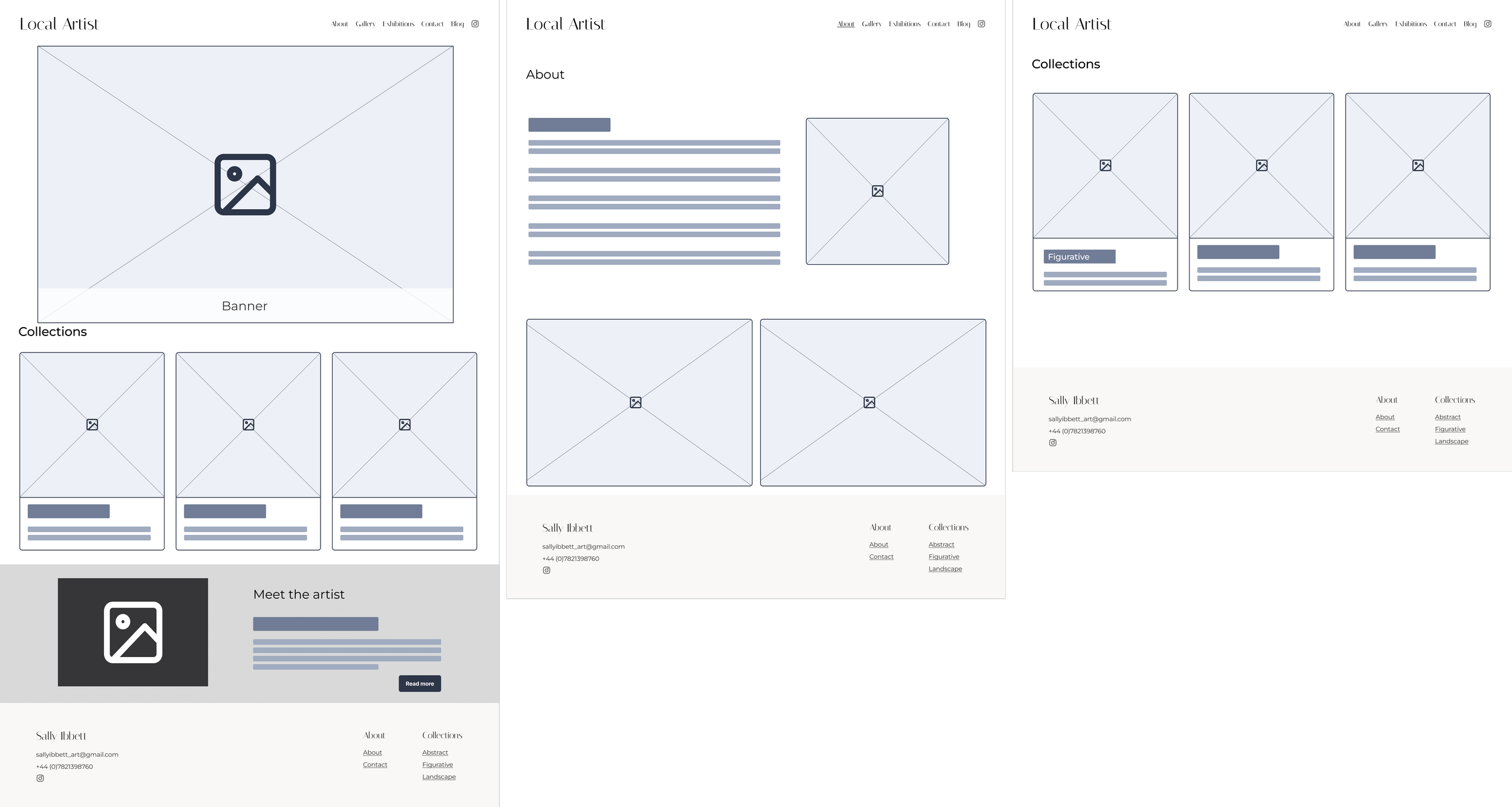
Low-Fi Wireframes
Low-fidelity wireframes enabled me to conduct early user testing and gather feedback, particularly on layout preferences and navigation between the Collection pages. This round of testing focused primarily on desktop, with some initial mobile screens included as well.
Style Tile
I collaborated closely with the client to understand the desired feel for their website. Together, we identified references to create a mood board, which informed the visual design developed in the style tile.
Prototype and Test
High Fidelity Prototype
Usability Testing
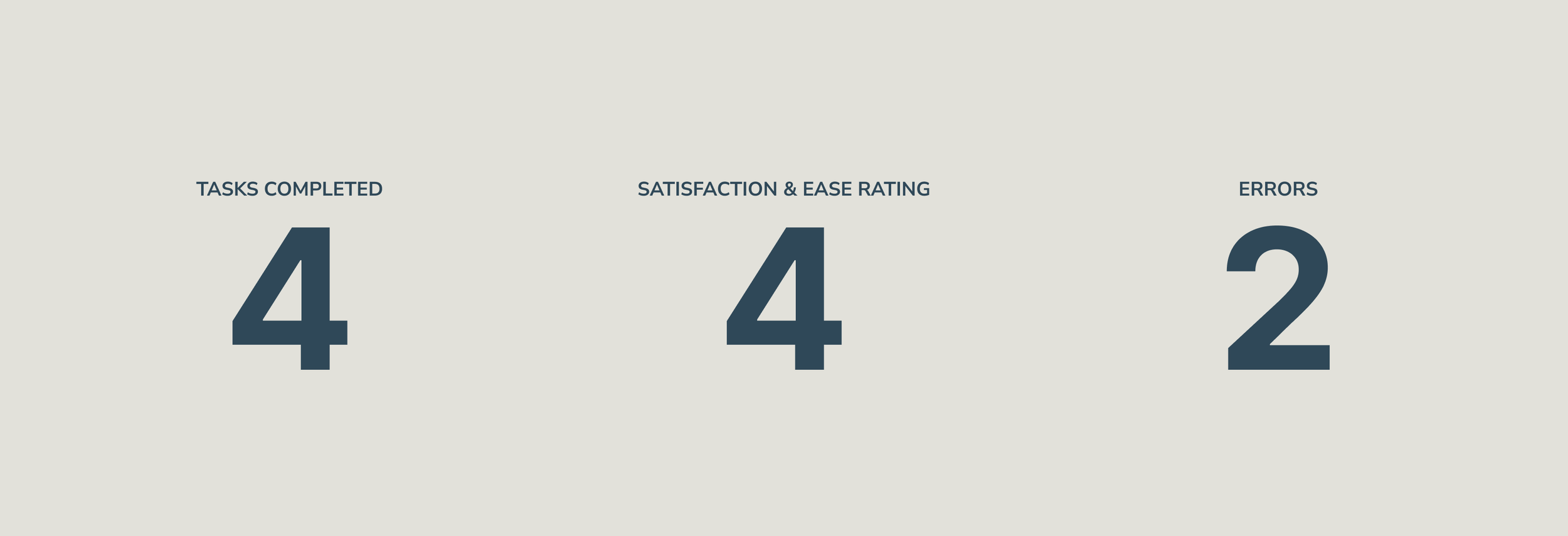
I tested the high-fidelity prototypes with five users, assigning them four tasks to complete and conducting a "five-second test," where they were given 5–7 seconds to view the homepage and provide first-impression feedback. Key findings included:
Users felt the site was visually and functionally good
Users found tasks easy and simple to complete without prompting
2 errors both missed the top Contact button
Users were unfamiliar with certain standard design patterns, which may reflect the older age demographic and their limited experience with digital tools. These included:
Not immediately identifying vertical or horizontal scrolling
Didn’t recognise logo/artist’s name as Home button
Avoided mobile Contact button as they thought it would call the artist
Unsure what action buttons with arrow icons will perform (directional swipe or click/navigate)
Key Revisions
In response to the usability tests, I prioritised revisions that would have the greatest impact, focusing primarily on navigation and wayfinding. Below are the key changes implemented to create the final prototype.
Conclusion
Working on this project taught me the value of close collaboration with both the client and the user. This approach allowed me to maintain a clear focus on the user’s needs while delivering a product that met the client’s expectations.
The project also emphasized the importance of testing assumptions across different demographics to ensure the designs are intuitive and effortless for all users.
Ultimately, I was able to create a digital product that successfully addressed the client’s key business goals while keeping simplicity and ease of navigation at its core.


